
trueqc
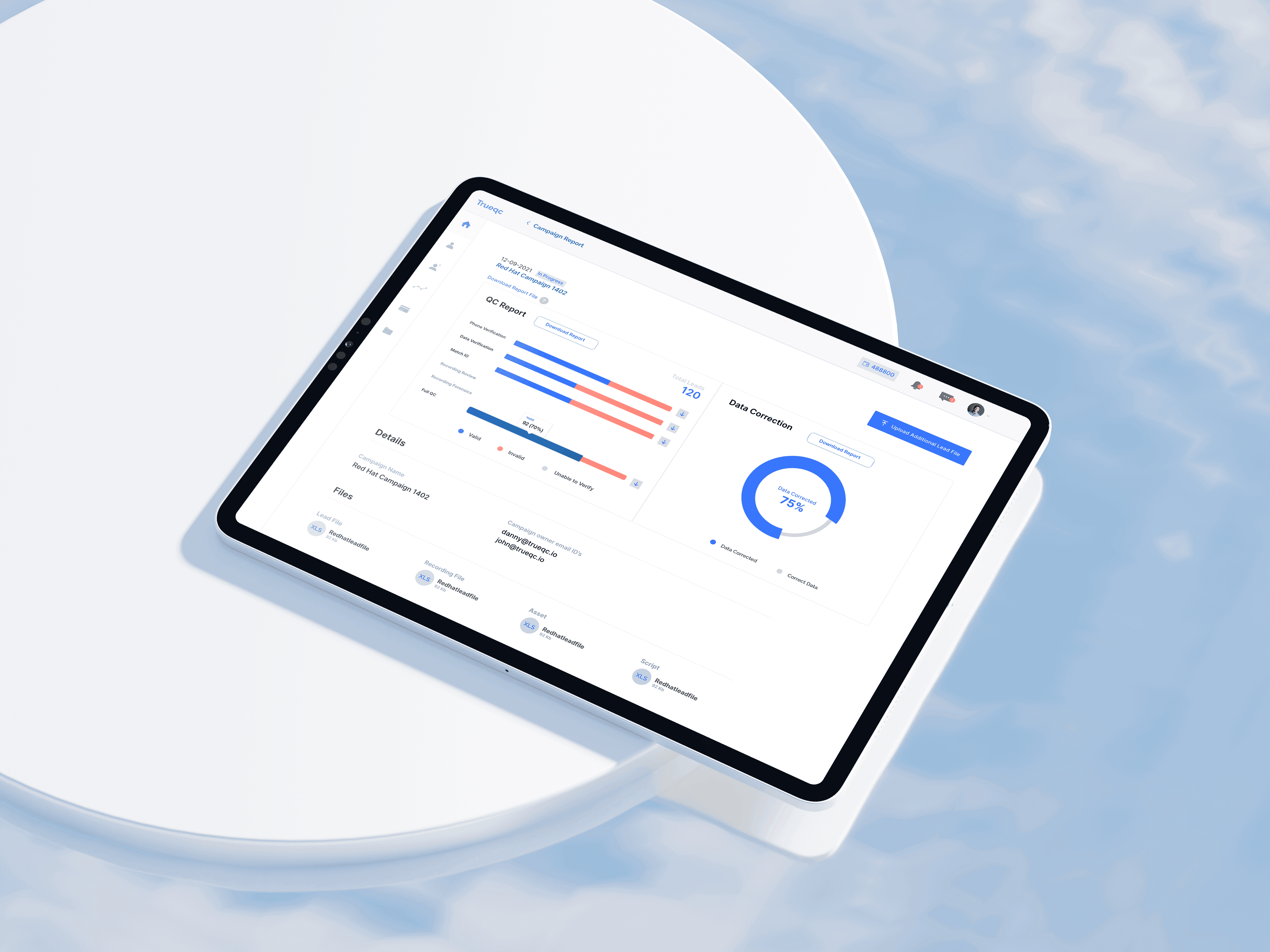
From clunky MVP to market-ready. Redesigning a lead qualification platform to reduce support dependency and scale with enterprise clients.
Role
Lead Product Designer
Deliverables
0>1 Product Strategy
End-to-end Visual
Design System
Front end
Team
1 Product Designer
3 Engineers
Date
2021 - 22 (11 months)
what is trueqc
A B2B lead qualification platform for
enterprise clients.
Enterprise clients submit campaigns, upload their lead files, and set targeting criteria. TrueQC's internal QC team then works through a 5-step manual process, data matching, verification, correction, and calling, before delivering a qualified lead report back to the client.
The users I was designing for were multiple stakeholders from the same company. Different roles, different levels of access, all working inside the same campaigns simultaneously. Professional users whose job depended on the tool working clearly
and without hand-holding.
the challenge
*The product had customers. It didn't have their confidence.
TrueQC had validated its model , enterprise clients were submitting campaigns, but but almost none could do it without help. The CSM team was fielding the same tickets every week. Churn was climbing. The core problem wasn't missing features. It was that existing ones didn't work in a way that made sense to users. I joined as the first product designer in a dev-heavy team. No design system, no defined process. My immediate task: make the MVP credible enough to stop the bleeding, then dig into what was actually wrong.
01.
Churn was climbing.
02.
Support was a crutch
03.
Adoption was low
My role/ Early work
Within the first 45 days of joining, I was tasked with polishing the MVP to make it look more credible. At that stage I had minimal context about the business and its users, so my focus was on quick, surface-level improvements. I refreshed the UI, introduced a lightweight brand identity, and redesigned the marketing site to improve first impressions.
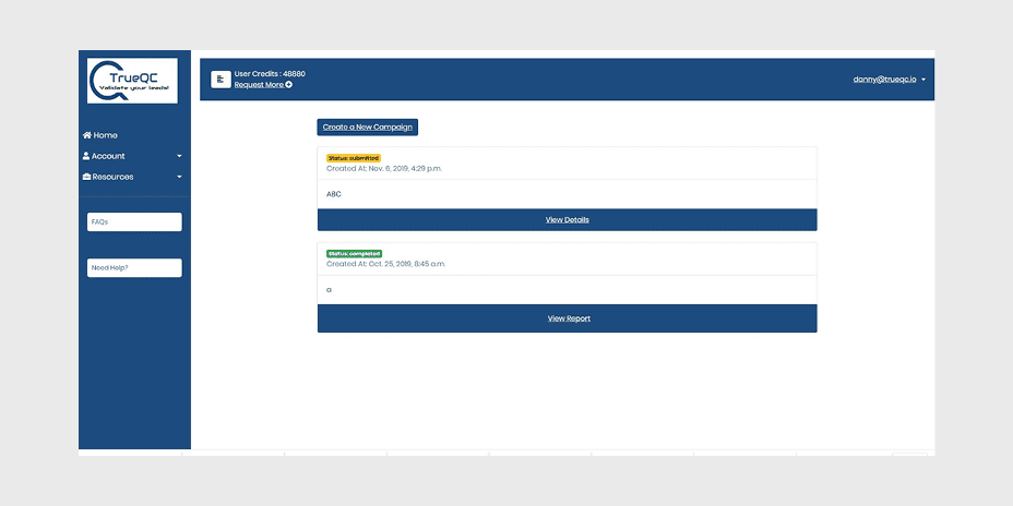
MVP
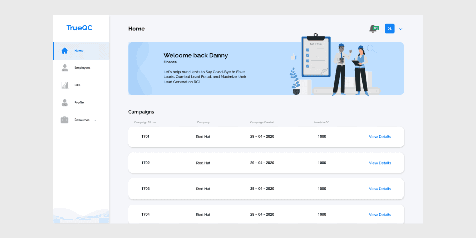
Visual redesign
Branding & Visual Language
These changes helped, but the process was far from perfect. Clients didn’t just want a better-looking tool. They needed a platform that actually worked for campaign submission, management, and reporting. That realisation shifted my approach from quick fixes to deeper research.
Research
The symptoms were clear. The causes weren't.
I knew churn was high, support was overwhelmed, and adoption was low. What I didn't know was why. I ran research across three channels simultaneously — and what I found went deeper than anyone on the team had expected.
Methods/
User Interviews
15 Active
Exit Interviews
10 Churned
Support Ticket Analysis
CSM
FullStory Analysis
15 Active
What I discovered/
Support Dependency
15 Active
Campaign Chaos
10 Churned
No Campaign Shortcuts
CSM
FullStory Analysis
15 Active
FullStory Analysis
15 Active
FullStory Analysis
15 Active
We conducted semi-structured interviews through internal channels like Intercom and a private Slack group created for closer interaction with clients. This gave us direct access to 15 regularly active users, where we explored their bottlenecks and pressing needs. To balance this view, we also ran 10 exit interviews with churned users. This gave me direct feedback on why people were sticking with the product and why they were leaving.
Support & Behavior Analysis/
Together with the CSM team, I reviewed support tickets to spot recurring points of friction. I also sat down with the sales team to hear what clients were asking for most often in calls and demos. To complement this, I analyzed Hotjar recordings and heatmaps, which revealed patterns of drop-off and highlighted where navigation felt unclear.
Active customers relied on CSM to complete tasks
Multiple campaigns with similar names, making it difficult to track the activities
Navigation Challenges
Users struggled to find key features, leading to increased support tickets
Multiple members managing the same campaign
Competitive Analysis/
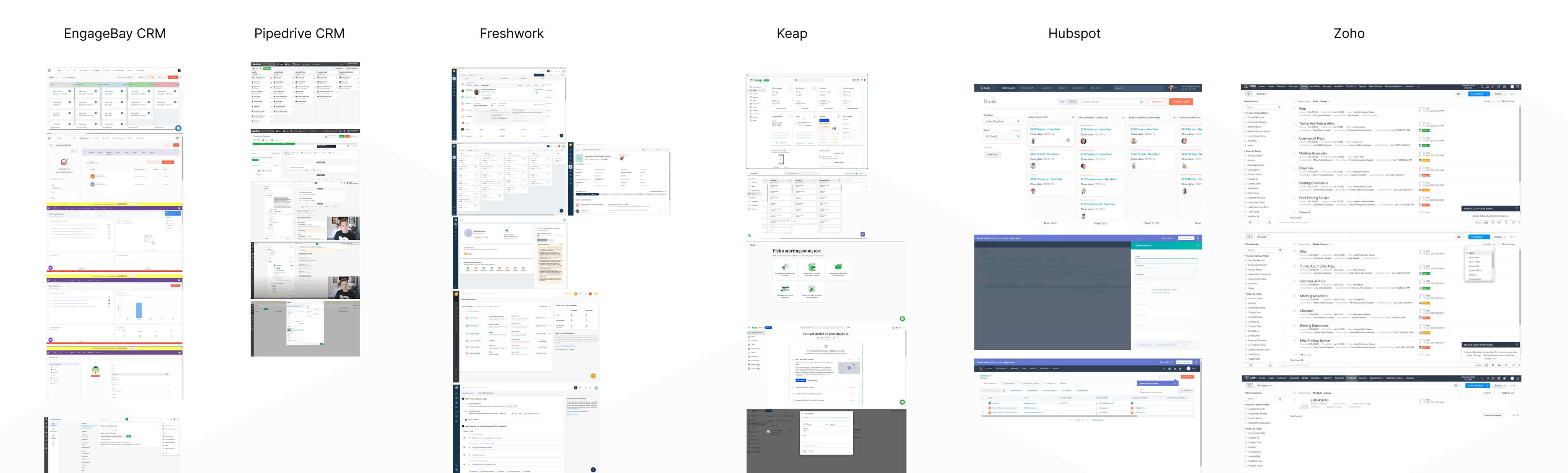
This was an ongoing resource present in the research phase for every feature. This specific board served as our first dive into competitors. We centered on analysing their dashboards and layout to rethink the structure and navigation of our app. We used it to identify strengths and deficiencies at this initial point of contact and as a guide for ideas we could include or pivot.
Research Insights
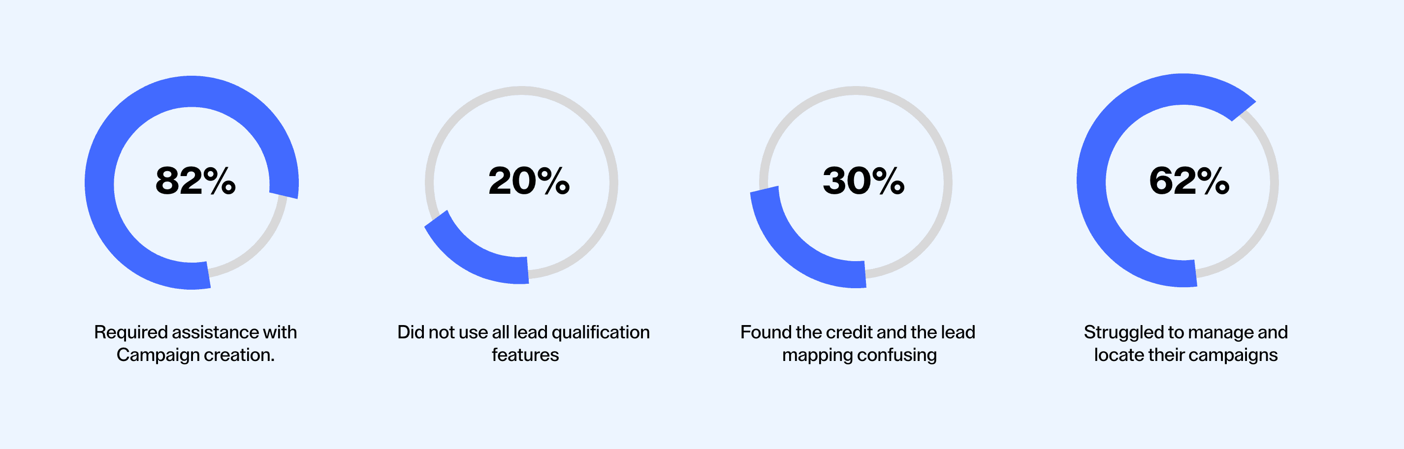
Campaign management was one of the biggest pain points. Users had no clear way to organise or track multiple campaigns.
Many clients leaned on the CSM team for even basic tasks. This dependency showed that the product wasn’t self-service enough to scale with enterprise clients.
Some users didn’t fully understand the platform’s features, especially the QC steps. They tended to stick to the basic functions while skipping more advanced ones, which limited the value they got from the product and directly impacted revenue.
Reporting lacked clarity. Clients wanted deeper insights into progress and outcomes, but the MVP only offered shallow, hard-to-interpret reports.
Multiple users often accessed the same account. This created overlapping actions and confusion around ownership.
A smaller group of users wished for a mobile-ready platform so they could perform activities on their phones as well.
There is an almost equal balance between tech-savvy and non-tech-savvy users. The average user expects contextual help and visual guidance to feel confident making choices.
Users work in various desktop screen sizes that demand a more responsive and scalable layout.
Interpret and Define
Synthesise findings
The app lacked clear guidance. Many features were hidden in menus or tied together with workarounds that forced users into repetitive actions. Workflows were not intuitive and gave little feedback, which made it hard for users to understand the impact of their choices. Because of this, feature adoption was low and difficult to sustain.
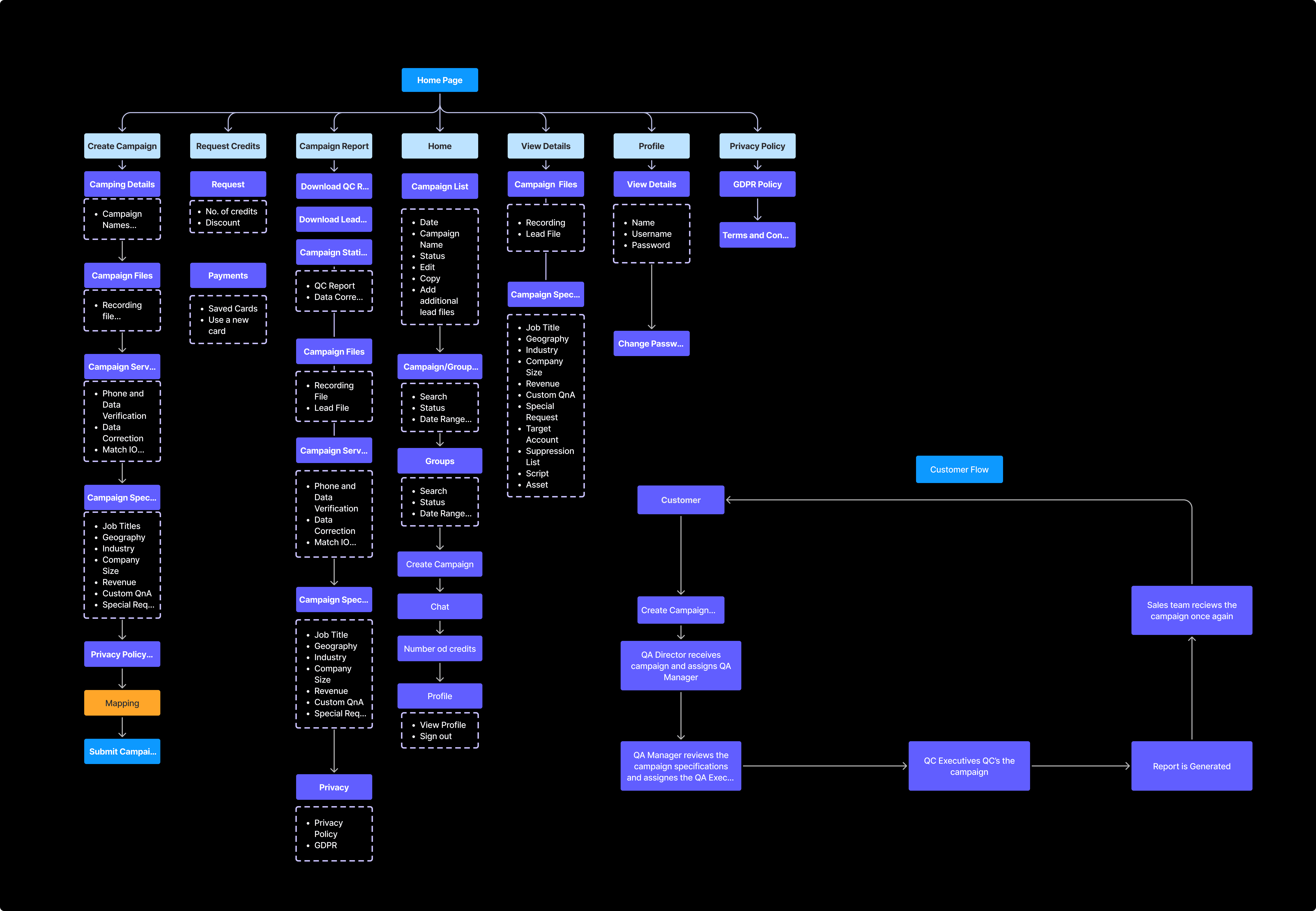
Site Map & User Flows
We ran tree tests to validate a new navigation structure of the app, ensuring a clear way of organising features, tools and information sections in an intuitive way without cluttering the sidebar. This process helped us:
• Reduce cognitive load by logically grouping features.
• Prioritise frequent actions for quick.
• Improve discoverability of underutilised but valuable features.
Ideate & Prototype
From this point forward, I entered a constant iterative process. User flows would be developed into wireframes to explore different alternatives at low and mid-fidelity levels. They evolved weekly through user feedback, adapting incremental improvements that ultimately shaped comprehensive workflows for all of the tasks.
Design System
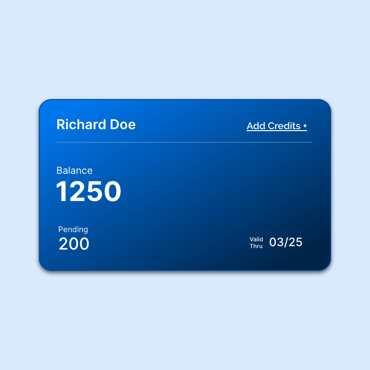
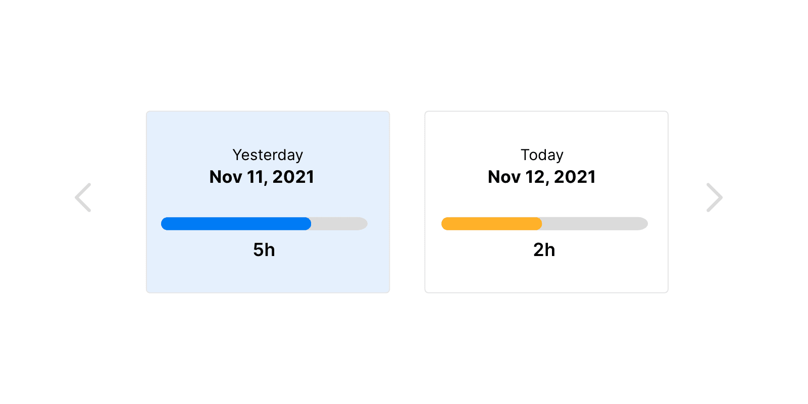
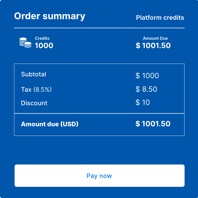
Before: Each new feature required extensive design time, custom development, and multiple review cycles. A typical feature took 2-3 weeks from design to development.
After implementing our new design system:
• Development time reduced by 25% through reusable components.
• Faster implementation with standardised naming conventions.
• Consistent UI patterns across platforms.
• Easy integration of new features into existing workflows.
• Reduced QA cycles due to pre-tested components.…
Final Screens
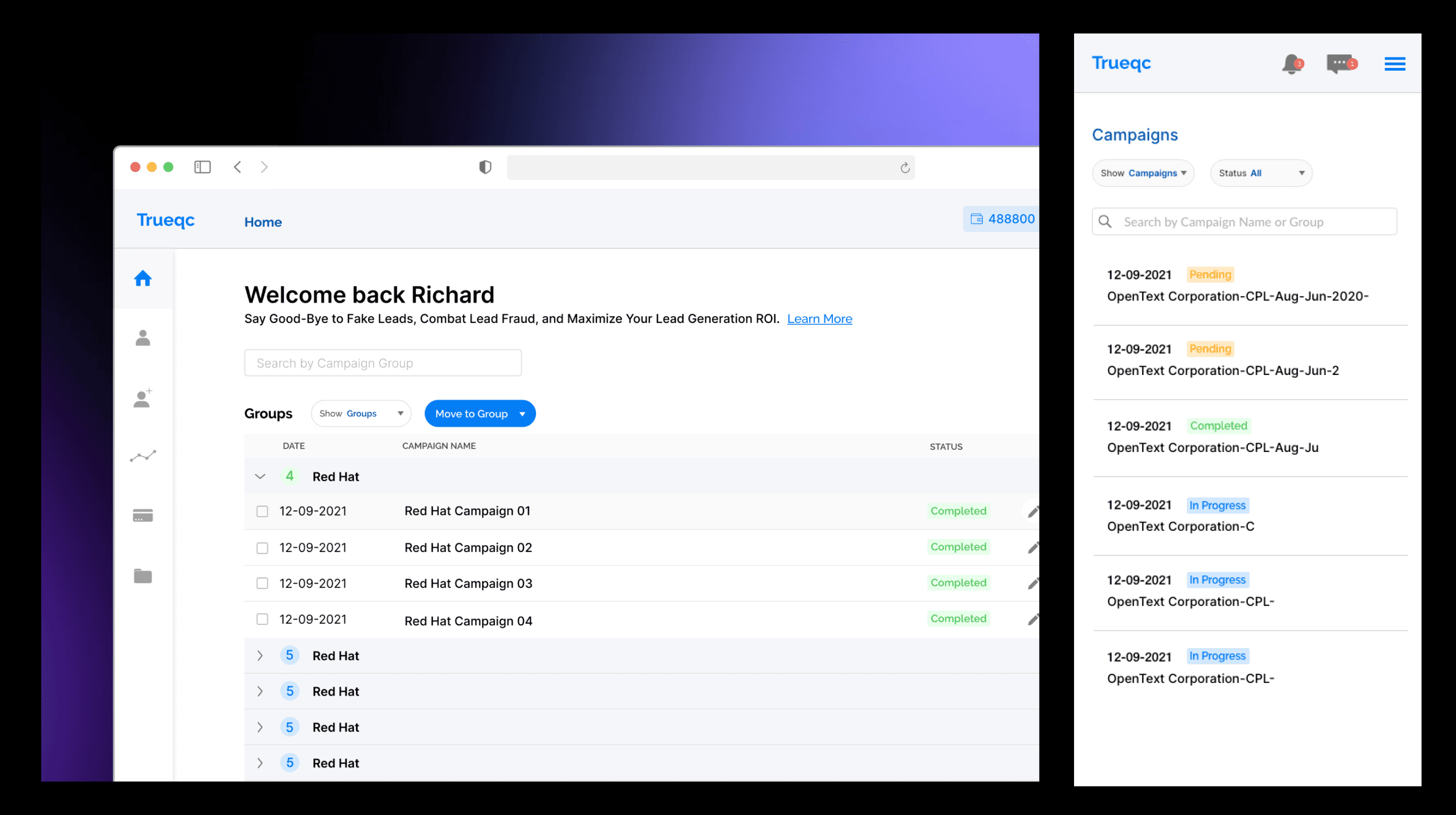
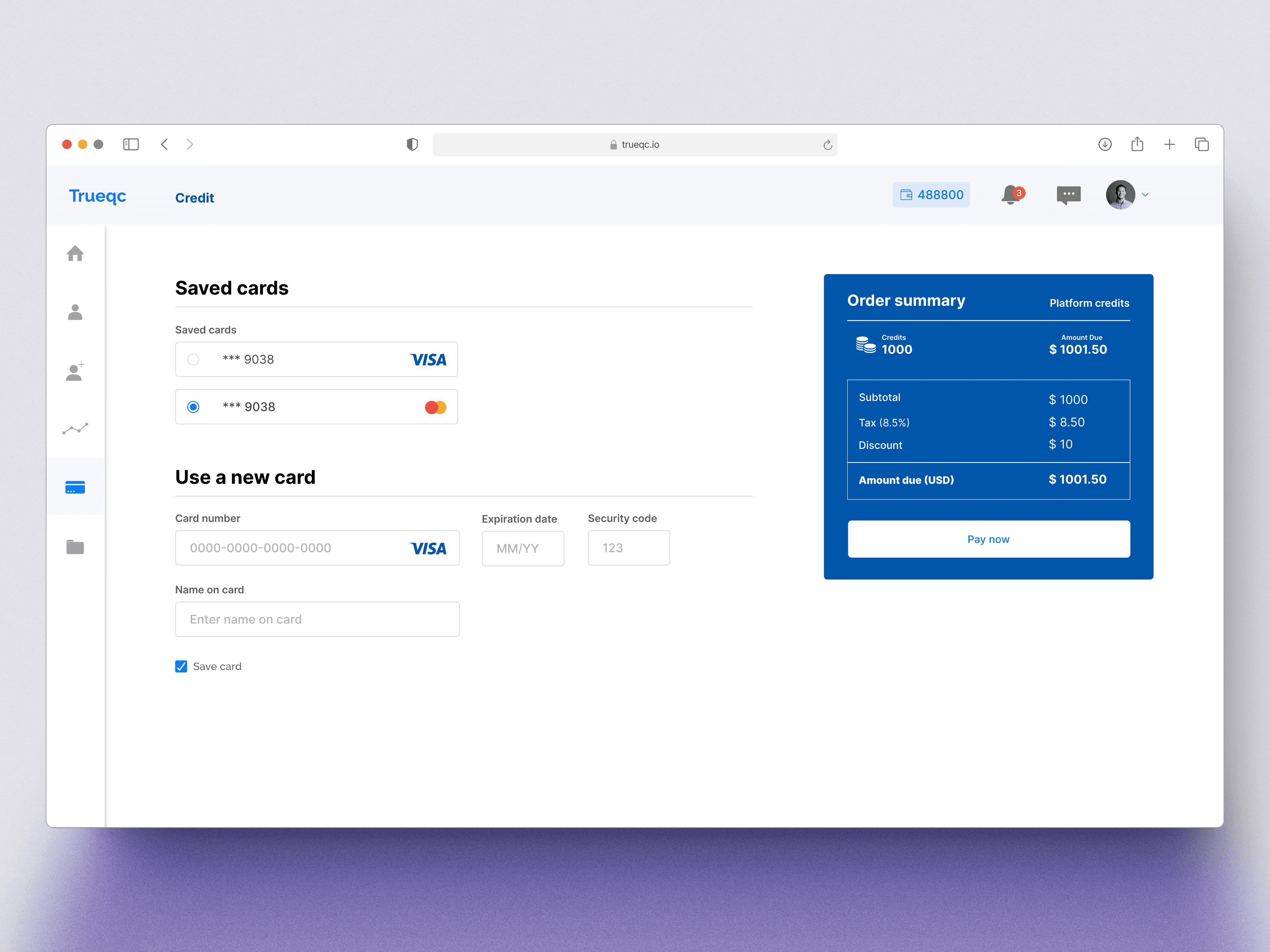
Simpified Lead and Campaign Management
• Smart filters and tagging system for easier organisation.
• One-click actions for approvals, rejections, and follow-ups.
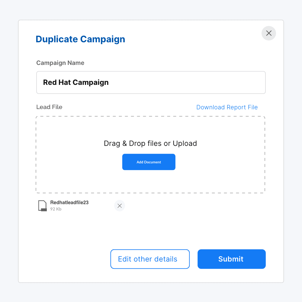
• Allowing to group similar campaigns.
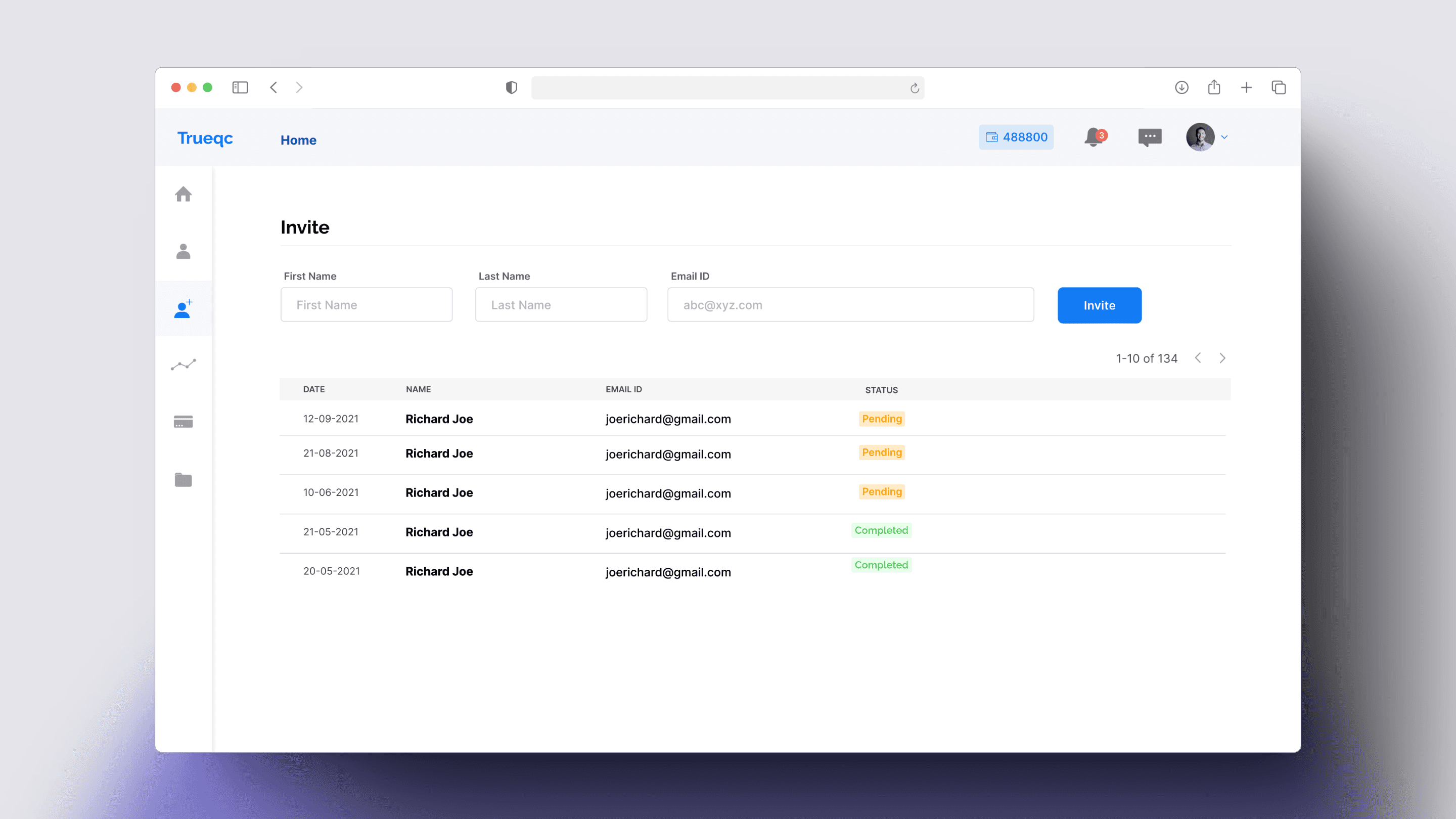
Collaboration features
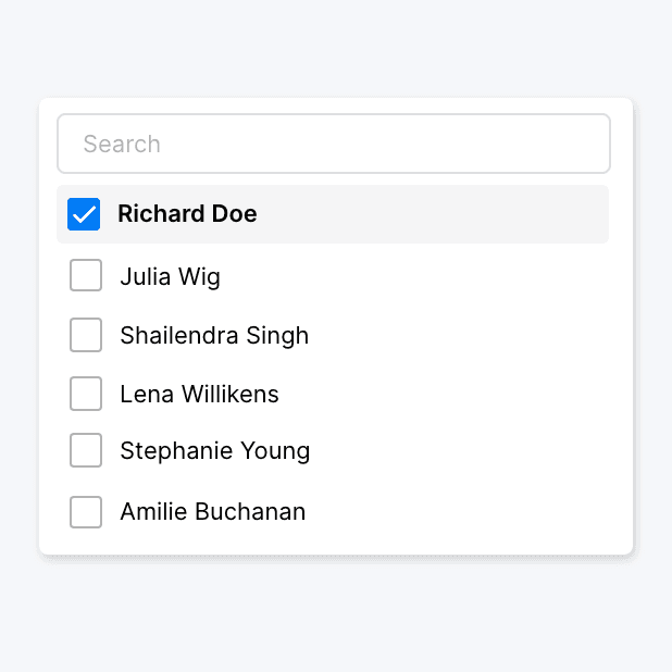
• Shared workspaces for teams to manage leads collectively. Multiple owners of the same campaign.
• Adding chat features for better customer support.
• Role-based access control for secure workflows.
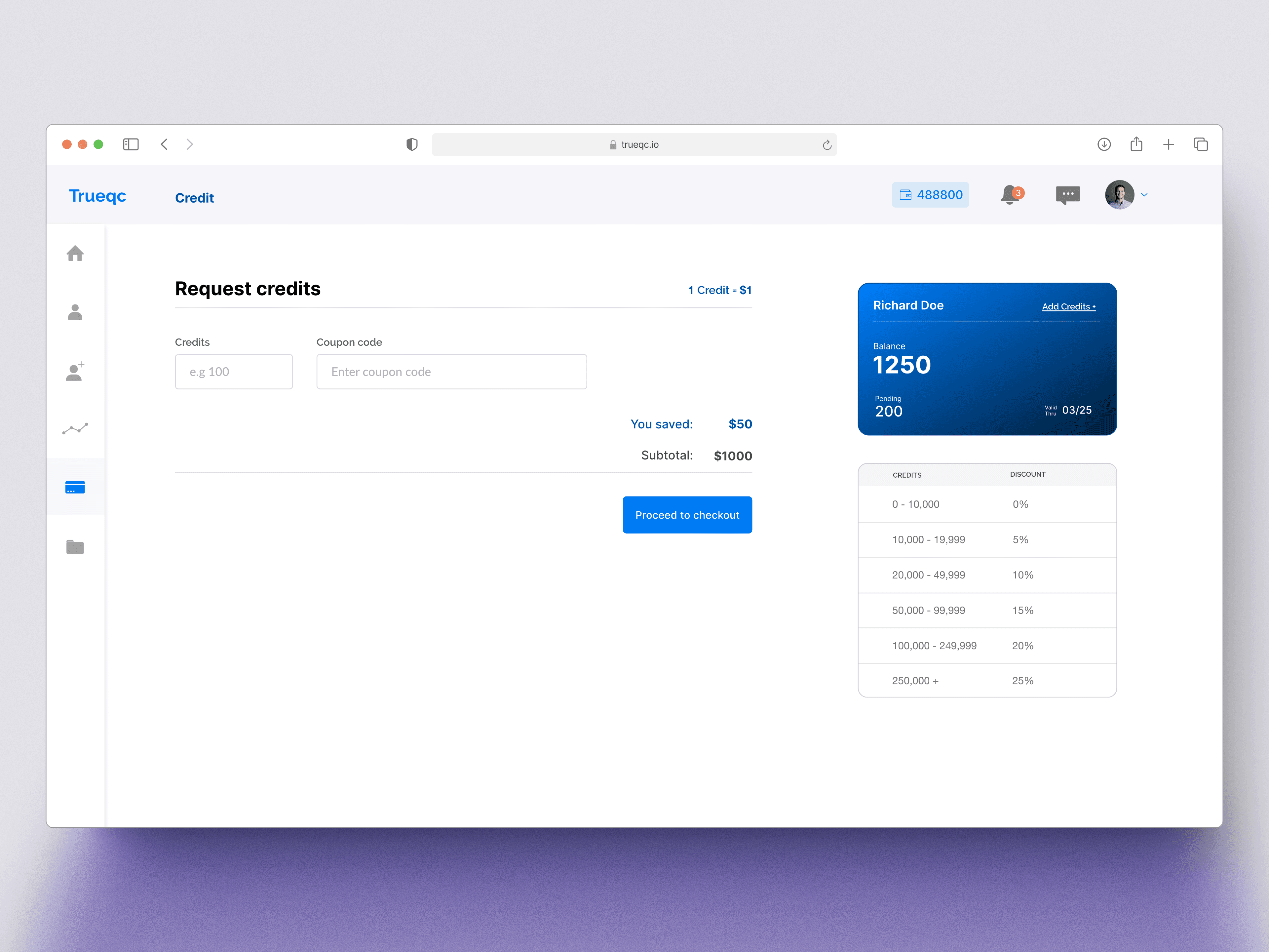
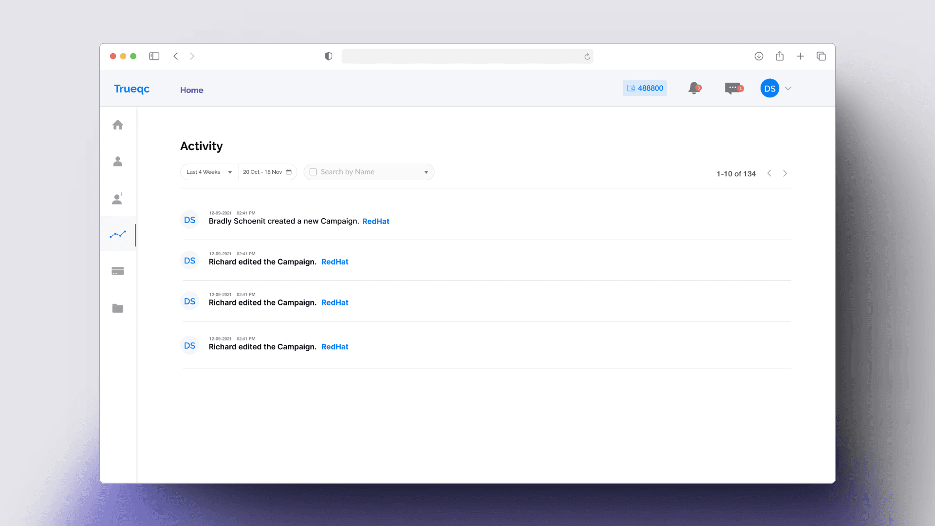
Data Visualisation and Insights
• Interactive charts for tracking lead conversion trends.
• Digestable performance metrics.
• Downloadable offline reports.port.
Outcome
As part of the dashboard redesign, we focused on adoption, usability, and business impact. The redesigned dashboard led to a 40% increase in feature adoption, particularly in the 6 step QC process. The improved onboarding experience resulted in a higher completion rate, with more businesses successfully setting up their dashboards. Additionally, retention saw a 25% improvement at 30 days and 20% at 90 days, showing stronger long-term engagement.
From a usability perspective, task completion efficiency improved significantly, with campaign completion time reduced by half and a 60% decrease in customer support queries. Users could now navigate key features with ease, enhancing overall engagement and satisfaction.
Business-wise, lead processing speed improved, directly contributing to higher conversion rates and revenue growth. The introduction of a scalable design system reduced development effort by 25%, allowing faster iteration cycles and better integration of future features. As a result, TrueQC positioned itself as a more efficient and user-friendly lead qualification solution, driving significant improvements across adoption, engagement, and busis impact.